What is that?
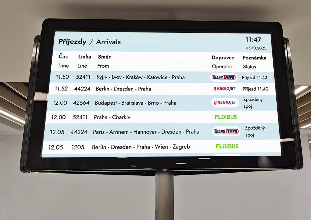
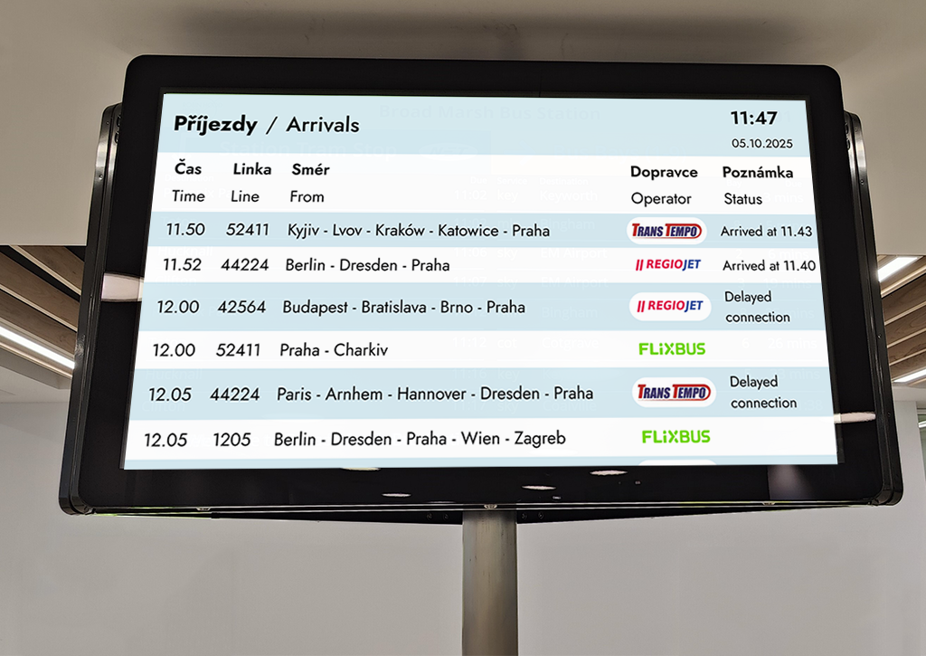
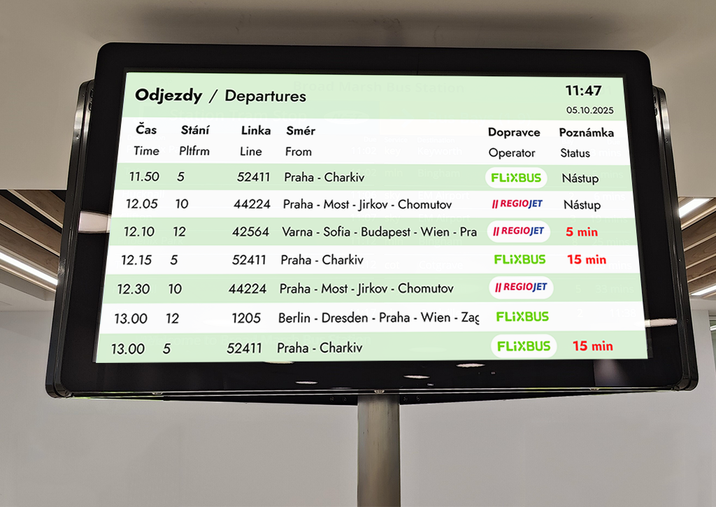
This is a redesign concept for a digital screen that shows bus departures and arrivals. I got the idea while waiting at a bus station in Prague — the screen there was hard to read, especially from a distance.I wanted to improve the overall user experience by making the information clearer, faster to read, and more accessible for everyone. It’s a simple design, but it solves a real, everyday problem. I focused on those points:
- Improved Readability – Clear fonts and higher contrast make it easier to read from a distance, even in crowded or stressful environments.
- Faster Information Access – Simplified layout helps travelers find key info like departure time, platform, and status at a glance.
- Bilingual Clarity – Status messages are shown in both Czech and English, making the display more accessible for international travelers.
My goal was to make it easier for travelers to quickly find what they need: time, platform, destination, and status. This project is about solving a real-world problem with small but impactful design decisions. It’s not flashy, but it’s functional — and that’s what makes it meaningful.
Research
While waiting at the main bus terminal in Prague, I observed how people interacted with the digital departure and arrival screens. Many travelers had to walk closer to the screen or squint to read the information. Some even asked others for help.I noticed a few key issues:
– The text was too small and dense.
– Important details like platform numbers or delay times didn’t stand out.
– The color scheme didn’t support quick scanning, especially from a distance.These observations helped me define the main problems and guided the design decisions I made in the next steps.
– The text was too small and dense.
– Important details like platform numbers or delay times didn’t stand out.
– The color scheme didn’t support quick scanning, especially from a distance.These observations helped me define the main problems and guided the design decisions I made in the next steps.